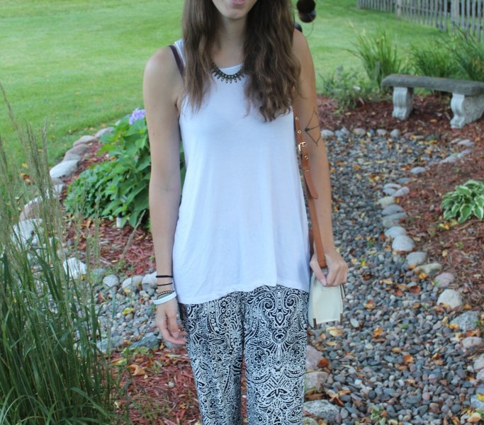
If you’re anything like me, you rarely stray from a solid black, white or gray color palette. I have never been one to wear a lot of pattern because solids are definitely in my comfort zone. However, this summer has been a summer of change. I have been attracted to loud patterns and bold pieces more and more. I am almost in a moral dilemma. I’m torn between simple black and white pieces and the exhilarating draw of prints. I recently came across Mara Hoffman’s newest spring/summer 2015 collection. If you are familiar with Hoffman’s aesthetic, it is usually one of loud neons and bold prints, things I would quickly run from. However, her newest collection really scaled back and focused more heavily on an easy, natural vibe. I instantly fell in love. This collection perfectly balances my need to stay true to classic colors and silhouettes while adding a brush of pattern and flair. The clouds have parted, and I can hear the Hallelujah chorus!
Taking inspiration from this collection, I decided to grab printed palazzo pant. My advice to those who stray from loud patterns is to pick something that is in a color range you are most comfortable in or flatters you best. Bold prints are a new territory for me, so I stuck with an all-black and white color palette to balance the change. It allows me to try something new while still feeling comfortable. I paired these baggy pants with a flowing white top to really exemplify the casual-comfy feel of this look. If you prefer showing your figure, simply add a crop top instead. Finally, I paired this look with a concho hat to add some depth and dimension.
Patterns can often be intimidating to those who rarely rock the trend. The easiest way to delve into the world of funky prints is to focus on pairing these garments with a color palette you feel most comfortable in. These summer months offer the best time to showcase this trend, and I’m ready to dive in head first!
Get My Look: 1. A pair of wide-leg pants. 2. A simple top. 3. A hat.

