It is almost officially spring and we are ready for it! Pantone, the number one provider of color systems, releases colors each season under their Fashion Color Report. According to Pantone, spring 2017 is all about “a mixture of vitality, relaxation and the great outdoors.” So let’s take spring 2017 and add some color to our wardrobes and here’s how!
PANTONE 13-0755 Primrose Yellow
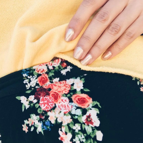
Spring is the start of good vibes with vacations, golden tans, and endless adventures. It’s a fresh new season and the color Primrose Yellow is the color representation of it. Pantone describes this color as “inviting us into its instant warmth, this joyful yellow shade takes us to a destination marked by enthusiasm, good cheer and sunny days.” Yellow can be a difficult color to style but is super fun to pair with patterns. Try making Primrose Yellow as your statement color and combine it with either geometric or floral patterns. (Photo via @alyssaaestrella)

PANTONE 15-0343 Greenery
“A refreshing take, Greenery is a tangy yellow-green that speaks to our need to explore, experiment and reinvent.” Bring out your adventurous side with Greenery. Nothing says explore like a nice camo pattern. With this shade look for patterns like camo or just go straight for Greenery and go for a relaxed look. This shade is perfect for an athleisure look styled with your favorite baseball hat or a dope sneaker. (Photo via @ameliachristineburns)

PANTONE 14-4620 Island Paradise
Island Paradise has to be the perfect shade of blue for the spring. It reminisces tropical waters and just makes you want to go on vacation. To Pantone, Island Paradise is “a cool blue-green shade that speaks to our dream of the great escape, Island Paradise is emblematic of tropical settings and our desire to unwind.” Island Paradise is a great subtle pop of color. When styling this shade look for pieces that have this color within the overall design or accessories in this shade easily add more color to your outfit without being too dramatic. (Photo via @baileyttaylor)

PANTONE 13-1404 Pale Dogwood
Pale Dogwood is a pale pink that we are no stranger to. Think about the infamous Kardashian neutral toned outfit the sisters love to wear. Pantone feels that Pale Dogwood “is a quiet and peaceful pink shade that engenders an aura of innocence and purity.” This shade looks great paired with other colors like Pantone Niagara that is more of a denim true blue. With a pink like this, I think we are accustomed to seeing it as the main piece but this season change it up and accessorize with it! (Photo via @idaretowear)

PANTONE 14-1315 Hazelnut
A neutral shade is never a bad thing to have in your closet. Pantone says that Hazelnut is this season’s key neutral shade “unpretentious and with an inherent warmth, Hazelnut is a transitional color that effortlessly connects the seasons.” When styling this shade don’t try to over-complicate things. Feel free to take a casual approach by wearing a super cute Hazelnut bodycon dress, a bomber, and sneakers. Very athleisure, comfortable and chic. What’s great about a neutral tone and basic items like a bodycon dress is that not only can you do a casual look but you can also dress it up with easy changes. Add your favorite jewelry, a cute pair of strappy heels and you’re right for a girl’s night out. (Photo via @withlovethelms)

Which one of these are you most excited to wear? Cast your vote in the comments below!
